
Client: GRM, NFT Marketplace
Role: Lead UX and Product designer
Bali, Indonesia
6 month project
Our approach
We employed the four pillar approach
Emphasis
Understanding User Needs
Conceptualisation
Transforming Insights into Strategy
Design
User-Friendly Features and Streamlined Interface
Development
Bringing the Marketplace to Life
Emphasis
In the beginning, we lacked understanding of user wants, needs and expectations
This gap ignited a 7-week user research sprint to illuminate the the wants and needs of our users.
Researching a blockchain competitor + SWOT analysis.
Interviewed 50+ users from NFT discord hubs

The blockchain
Roaming the competitive landscape
Existing platforms like OpenSea, Rarible, and Foundation.app primarily use Ethereum. These marketplaces suffered from:


Slow transactions

High fees

Cluttered interfaces

By analysing these insights, we identified key user types.
Artists: Seeking a platform with low fees and user-friendly tools to showcase and sell their work.
Collectors: Craving real-time market data and insightful trends to make informed investment decisions.
A breakdown of our target audience.

The Aspiring Artist

The Discerning Collector

The Curious Enthusiast
Verbal Kint, 25, Graphic Designer, Melbourne, AU
Goals:
Explore NFTs, collect and potentially create NFTs.
Needs:
Educational resources.
Pain Points:
Difficulty finding beginner-friendly platforms.
Creating a strategy, from data to action

Overwhelmed with insights, we employed a two pronged approach.
Priority: We identified the most critical user pain points, wants, and needs. This ensured our platform addressed top user concerns.
Insights Arsenal: We leveraged various tools, such as affinity maps, card sorting and customer journey mapping to extract actionable insights.
We grouped key ideas and user quotes to identify patterns and areas for improvement in buying and selling experiences

Insight arsenal
We mapped the user journey, pinpointing key touch points. This revealed user frustrations, buying/selling behaviours, and "pause points" for improvement.

Wallet Integration: Users found the technical aspects overwhelming.
Browsing: The overload of information caused users to lose their way.
Minting: Users lacked clear understanding during the minting process.


Connect your wallet" for fast trading.
Implement filters for easy navigation to specific art, collections, or artists.
Provide clear and simple steps for effortless minting.

Making a plan from our insights.


Design
A tight deadline loomed for development. Key questions demanded answers.
Should we design for mobile users?
What points should we focus on first?

Data driven results for going mobile-first
Research reports (e.g., NonFungible.com) and user behaviour analysis (via Google Analytics and user interviews) revealed a clear trend: 70% of users accessed NFT marketplaces on mobile devices compared to only 30% on desktops.


Insights for
mobile-first design
Following the users journey, to understand, navigate and pinpoint.


Design pitstop
Testing our strategy with design thought
In this next part of the adventure, we'll look at some of the design strategies we took.
1. Increasing user engagement for new users.
2. Who is the winning blockchain of choice?
3. Is connecting your wallet enough or not?
4. Revealing the winning minting experience.
Lets gooooo!
A/B Testing Reveals the Winning Minting Experience
We conducted A/B testing to optimise the minting process for users. Here's what we discovered:

Option A: Simple Progress Bar
Grouped information into three steps (Upload, Mint, List)
with a basic progress bar.

Option A: Minimal Approach
No progress bar, just a "Next" button.
Option A, a clear winner.
Option A, the simple progress bar with grouped information, led to an impressive 85% increase in user engagement during minting.
1. Users preferred a progress bar (Option A). This provided a clear understanding of their position within the minting process, fostering a sense of control.
2. Grouping information into three distinct steps (Upload, Mint, List) simplified the process and reduced user intimidation during minting.
3. Improved user engagement and created a more streamlined minting experience.

Revealing the Blockchain of choice

A/B Testing Blockchains
To identify the optimal platform, we conducted A/B testing with two leading blockchain options:
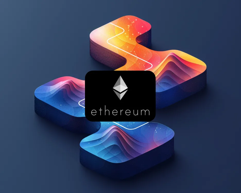
Option A: Ethereum
Renowned for its security and widespread adoption. However, Ethereum is known for its high gas fees and slow transaction speeds (15-45 tps).

Option B: Solana
A newer blockchain.
Solana offered significantly lower fees and blazing-fast transaction speeds (65,000 tps)
.
The Winner: Solana Blockchain
Based on user behaviour and preferences, Solana emerged as the clear winner. Here's why:
1. Users preferred the cost-effectiveness of Solana's lower gas fees. Making buying and selling NFTs cheaper for users.
2. Faster transaction speeds on Solana eliminated long waiting times, significantly improving user experience.
3. Reduced fees allowed artists to mint more NFTs and expand their collections.

Sign-Up Showdown.
Connect Your Wallet and Blast Off!
We A/B tested signup methods for fastest user onboarding!
Option A. Connect wallet only
Renowned for its security and widespread adoption. However, Ethereum is known for its high gas fees and slow transaction speeds (15-45 tps).

Option B. Traditional sign up as a new user
A newer blockchain.
Solana offered significantly lower fees and blazing-fast transaction speeds (65,000 tps)
.
Wallet wins the race!
75% of users loved the "Connect Wallet" option! It's super-speedy and gets you exploring NFTs in a flash.
New to crypto? No sweat! We offer clear guides to explain the best Solana wallet, Phantom Wallet and get you started with ease.
Stay secure and private. your wallet keeps your information under wraps.

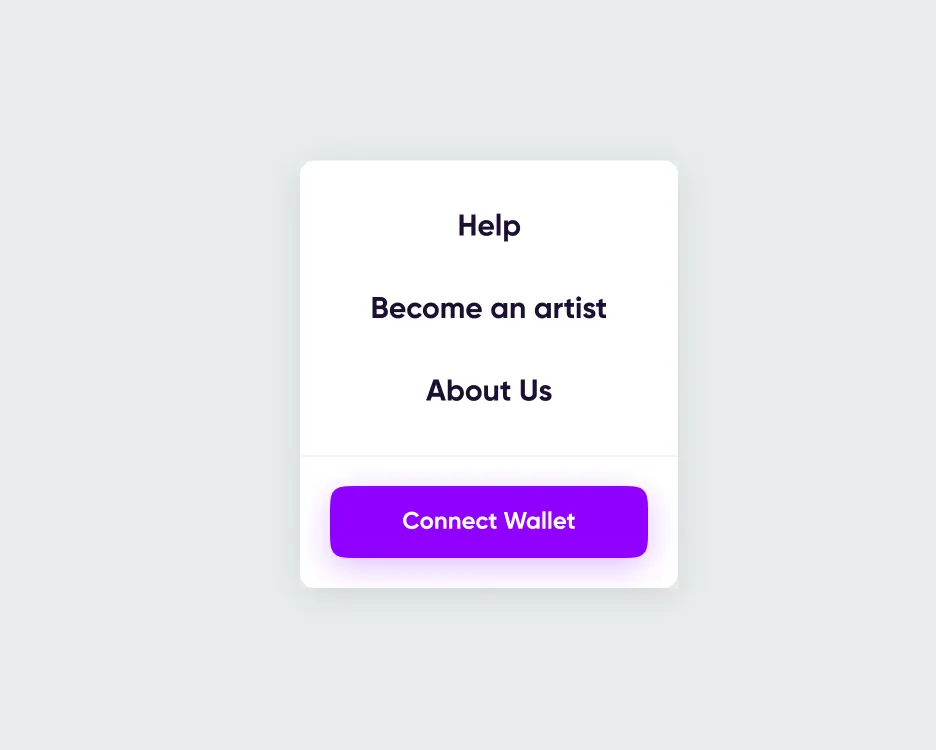
Increasing user engagement with guides and tutorials
Getting lost in a new marketplace can be frustrating. How could we help new users feel confident and ready to explore?
We tested three ways to offer user guides and tutorials for new users.

Hidden Help Page
Tucking guides in a separate "Help" page
meant users might miss them entirely.
(Disadvantage: One extra click can feel like a hurdle)

No guides at all?
Yikes! This left newbies feeling stranded
on an NFT boat adrift in the ocean.
(Disadvantage: Confusing and frustrating)

Homepage guides win!
Here's why:
1. Easy to Find: No need for hunting!
2. Clear guides empower new users to explore the marketplace with ease.
3. User education attracts more beginners and helps build an NFT community.

Making a plan from our insights.
Dayum!
We hit a snag!
We didn't fully understand what developers needed to build our project. But fear not, we took action!

Development
Jumped into a 10 week search, to find the right developers
28+ interviews individual developers, 2 blockchain agencies, 1 recruitment agency, over Zoom online.
What did they need to start?
How much is this going to cost and time to build?

Developer insights
Chose Rockettech, a blockchain agency in the Ukraine, they had all the resources under one roof.
Discovery phase documentation, with a breakdown of the GRM's marketplace.
A cost and time estimation of the project.
Team growth. Project manager, frontend developer, a Solana blockchain developer, smart contract developer and business analyst to the team.

Final design
The unveiling


User-Centric Wins


Solana
Speeds up the game
This blockchain's lower costs and faster transactions were a game-changer!
King
Intuitive navigation is king
A user-friendly experience was paramount for a smooth and enjoyable journey.
Teamwork
Collaboration
Collaboration was essential for achieving our goals quickly and efficiently.
Lets go!
User research
GRM listened to users, smoothed out the platform, and prioritised user needs first.
What we would do differently
Early Feedback is Golden. We would have incorporated more user testing throughout the process to ensure we were on the right track.
Testing, Testing, 1, 2, 3! A wider range of feature testing, like notification settings, could have enhanced user engagement.
Risk Management. A Balancing Act: The volatile crypto market presented a challenge. A more robust risk management plan could have helped navigate uncertainties.

The Project's Fate
Unfortunately, due to a market crash just before the build phase began, the project was put on hold after 6 months of dedicated work.