Financing
your new ride in Australia

Redefining the way Australian’s get
finance to buy a vehicle.

Financing
your new ride in Australia

Redefining the way Australian’s get
finance to buy a vehicle.

Financing
your new ride
in Australia

Redefining the way Australian’s get
finance to buy a vehicle.

01

Regulators, Mount up!

Regulators Mount up!

Regulators, Mount up!

April 2018. Stratton Finance, helps people and businesses get loans easily for vehicles.

They wanted to grow their user base and expand their business in Australia.

Pitstop

Pitstop

Pitstop

Stratton Finance, wanted to shift gears and streamline their car loan application process.

The traditional paper- based approach was clunky, slow, and relied heavily on broker interaction, leading to frustration and missed opportunities.

02

03

Shifting gears, on a mission

Shifting gears, on a mission

Shifting gears, on a mission

Design a user-friendly, end-to-end Progressive Web App PWA that empowers Australians to cruise through the car loan application process online.

The goal? A smooth 30% increase in conversion rates.

Flying, down the straight

Flying, down the straight

Flying, down the straight

To achieve our vision of a "sweetaz" ride, we employed a three diamond UX strategy.

  1. Emphasis: Understanding User Needs

  2. Conceptualise: Transforming Insights into Strategy

  3. Design: User-Friendly Features and Streamlined Interface

04

05

Eyes on the road

Eyes on the road

Eyes on the road

Let me tell you a tale of our "sweet!" road trip made successfully. (Broom, broom!)

Financing
your new ride in Australia

Redefining the way Australian’s get
finance to buy a vehicle.

01

Regulators, Mount up!

April 2018. Stratton Finance, helps people and businesses get loans easily for vehicles.

They wanted to grow their user base and expand their business in Australia.

Pitstop

Stratton Finance, wanted to shift gears and streamline their car loan application process.

The traditional paper- based approach was clunky, slow, and relied heavily on broker interaction, leading to frustration and missed opportunities.

02

03

Shifting gears, on a mission

Design a user-friendly, end-to-end Progressive Web App PWA that empowers Australians to cruise through the car loan application process online.

The goal? A smooth 30% increase in conversion rates.

Flying, down the straight

To achieve our vision of a "sweetaz" ride, we employed a three diamond UX strategy.

  1. Emphasis: Understanding User Needs

  2. Conceptualise: Transforming Insights into Strategy

  3. Design: User-Friendly Features and Streamlined Interface

04

05

Eyes on the road

Let me tell you a tale of our "sweet!" road trip made successfully. (Broom, broom!)

Client: Stratton Finance

Role: Lead UX & UI

Client: GRM, NFT Marketplace

Role: Lead UX and Product Manager

1x CEO, 1x CTO, 1 Digital Transformational Manager, 1x BA, 10x Marketing Team

1 Project manager,
1x Product designer,
1x Marketing manager,
1x UI designer

Melbourne, Australia

6 month project

6 mth project

Under the Hood

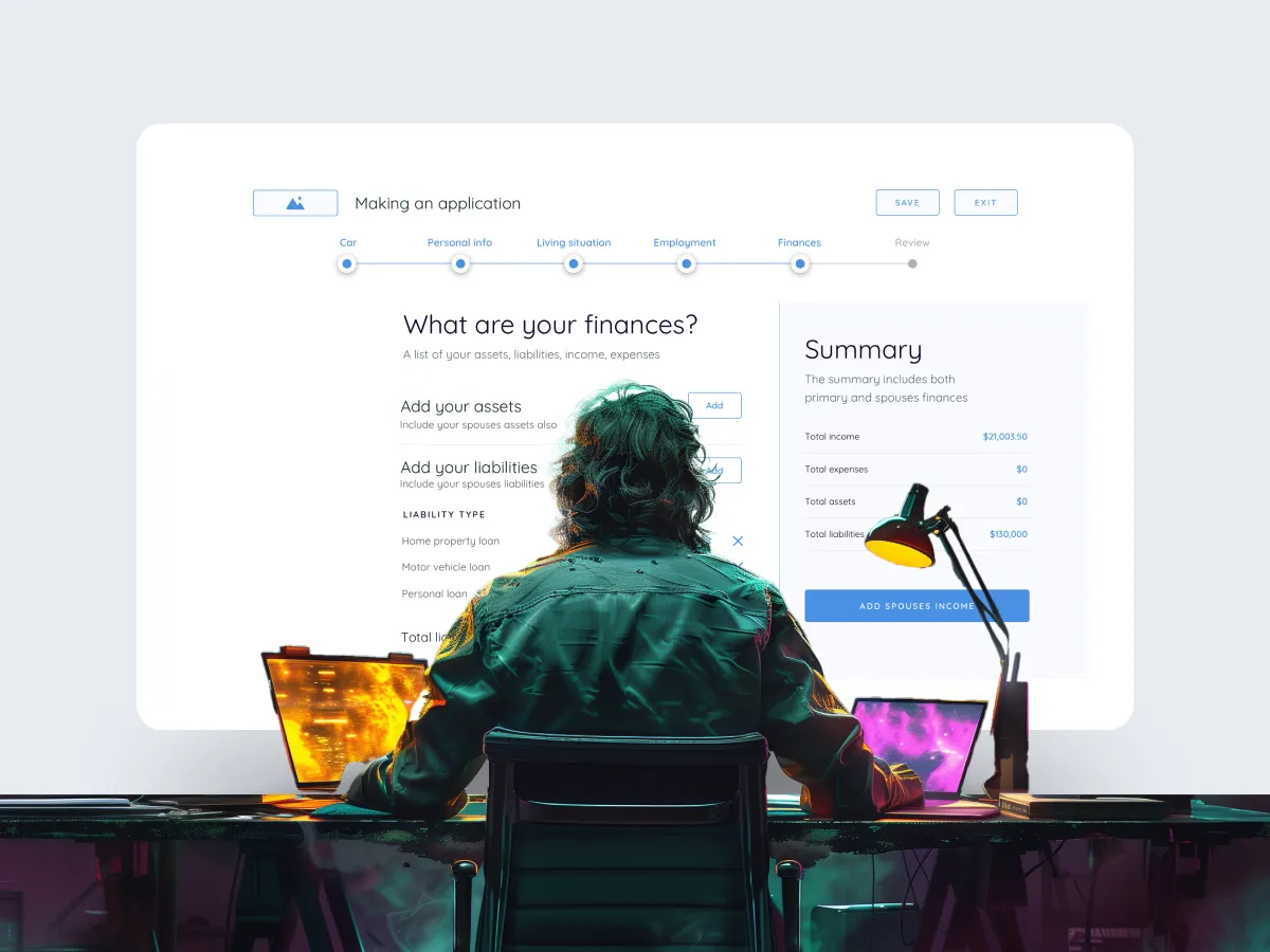
Before hitting the design gas, we needed to understand our users


This gap ignited a 4-week user research sprint to illuminate the the wants and needs of our users.

  1. Researching our competitors + SWOT analysis.

  2. Interviewed 12+ brokers from Stratton Finances team.

User research

Under the hood

Under the hood

Under the hood

Broker interviews and a competitive analysis (think Capital Finance Australia and Max Finance) revealed key pain points:

  • Slow and Error-Prone: Paperwork woes led to typos and delays.

  • Broker Bottleneck: Reliance on brokers slowed the process and limited user control.

  • Limited Accessibility: Applying for loans was restricted to business hours – not ideal for busy Aussies.

  • Tech-Fatigue: Users craved a modern, digital experience to match their on-the-go lifestyles.

Meet Our Passengers

Understanding
our audience

Understanding our
audience

With these insights, we buckled up and defined three key user personas:

The Busy Professional

Sarah Johnson . 35 . Marketing Manager


Needs: Quick, convenient loan process to fit busy schedule.

Challenges: Limited time, balancing work and personal commitments.

Wants: Fast approval, minimal paperwork, easy-to-use online interface.

32, Digital Artist, San Francisco, CA.

Goals:
Showcase art, earn income.

Needs:
User-friendly platform with minimal fees.

Pain Points:
High minting fees.


The First-Time Buyer

Alex Martinez . 28 . Electrician


Needs: Guidance navigating the loan process as a novice buyer.

Challenges: Lack of experience, uncertainty about loan options.

Wants: Clear explanations, support from professionals, simplified process.

Keyser Söze, 45, Tech Entrepreneur, London, UK

Goals:
Expand portfolio, invest.

Needs:
Advanced discovery tools.

Pain Points:
Authenticity and security concerns.


The Tech-Savvy Millennial

Dave Stephens . 25 . Graphic Designer


Needs: Tech-driven loan process with seamless online experience.

Challenges: Frustration with outdated, paper-based methods.

Wants: Digital application, instant approval, mobile-friendly platform.

From Data to Roadmap

From Data to Roadmap

Conceptualising the Ride

Next, we prioritised user needs and pain points

Think of it as an affinity mapping pit stop. Here's what we discovered:

  • Heavy Paper Reliance: This was slowing everyone down and increasing errors.

  • Accessibility Woes: Applying outside business hours was a no-go.

  • Upload Frustration: The current document upload process resembled a flat tire – a pain to deal with.

  • Lack of Transparency: Users desired clear updates on their application status.

Affinity grouping

Affinity grouping

We grouped key ideas and user quotes to identify patterns and areas for improvement in buying and selling experiences

Pacing out the flow

Understanding the complicated

Multi tasking

Pacing out the flow

Understanding the complicated

Multi tasking

Pacing out the flow

Understanding the complicated

Multi tasking

Pacing out the flow

Understanding the complicated

Multi tasking

Insight arsenal

Customer journey

Customer journey

We mapped the user journey, pinpointing key touch points. This revealed user frustrations, buying/selling behaviours, and "pause points" for improvement.

We mapped the user journey, pinpointing key touch points. This revealed user frustrations, buying/selling behaviours, and "pause points" for improvement.

The user journey key insights

The user journey key insights

The user journey key insights


We then mapped the user journey, pinpointing opportunities to:

  1. Simplify the application process.

  2. Offer flexible document upload options.

  3. Provide ongoing support throughout the journey.

  4. Personalise the experience based on user needs.

Design decisions

Design
decisions

Green light! unveiled design

Putting them in the driver's seat

User voices

User voices

"I want quick approval, less paperwork, and simple online interface."
Busy professional - Sarah

"I want quick approval, less paperwork, and simple online interface."
Busy professional - Sarah

"Explanations, support, and a simplified loan application process"
First-Time Buyer - Alex

Design

Time was of the essence, and a desktop-first approach was taken


  1. We designed a mid-fidelity prototype.

  2. Conducted user interviews from the prototype to refine our design thinking.

Desktop First for Stratton Finance PWA

Desktop First for Stratton Finance PWA

For testing purposes, we went for a bigger screen, showcasing loan details or letting users compare options side-by-side.

We all know it's responsive. Buckle up, because this A/B test unearthed some surprising treasures (and a couple of snags).

For testing purposes, we went for a bigger screen, showcasing loan details or letting users compare options side-by-side.

We all know it's responsive. Buckle up, because this A/B test unearthed some surprising treasures (and a couple of snags).


Key insights

Key insights

Key insights

The feedback from users was crucial in shaping the final product:

  1. Desktop-First Strategy: While mobile compatibility is on the roadmap, user research justified focusing on desktop development due to easier data input and security advantages.

  2. Dashboard Delight: Users loved the idea of a centralised dashboard for managing applications and progress.

Shifting Gears.
We put together
a roadmap

Shifting Gears.
We put together
a roadmap

Pinpointing opportunities to focus on

A/B testing became our pit crew, helping optimise specific features and minimise drop-off points.


Here's where the magic happens and we explore:

1. Simplifying the navigation.
2. Reducing drop-offs during account creation.
3. Progress bar vs user confidence.
4. Exploring support and help options.
5. Flexible uploading document options.

Testing the prototype
with users in tow

We hired 15+ people from Airtasker to come in and test our prototype. Observing, asking questions and listening.

Observing the process

Listening to feedback

Progress

Testing the prototype
with users in tow

We hired 15+ people from Airtasker to come in and test our prototype. Observing, asking questions and listening.

Observing the process

Listening to feedback

Progress

Testing the prototype
with users in tow

We hired 15+ people from Airtasker to come in and test our prototype. Observing, asking questions and listening.

Observing the process

Listening to feedback

Progress

Testing the prototype
with users in tow

We hired 15+ people from Airtasker to come in and test our prototype. Observing, asking questions and listening.

Observing the process

Listening to feedback

Progress

01-A/B Test.
Simplifying the User Journey with Multi-Stage Navigation

01-A/B Test.
Simplifying the User Journey with Multi-Stage Navigation

Version A: Single-page application

Single-page application with all information and steps displayed at once.

Version B: Multi-page application

Clear separation into stages ("Make an Application" and "Get & Approval").

Version B.
Why it rocks!

Version B.
Why it rocks!


  1. Breaking the process into stages (Version B) made it easier to use.


    Users weren't overwhelmed by upfront information (engagement +45%).


  2. Clear labels guided users through each step.


  3. Separate stages allowed for quick scanning and reduced anxiety (fewer drop-offs).

02-A/B Test.
Reducing Friction with Optional Account Creation

02-A/B Test.
Reducing Friction with Optional Account Creation

Version A: Mandatory account creation

Mandatory account creation before starting the application process.

Version B. Flexible step during the application process

Account creation offered as an flexible step during the application process.

Version B.
Making account creation flexible and O-natural

Version B.
Making account creation flexible and O-natural


  1. By making account creation optional in Version B, the application process felt less intrusive for users who might be hesitant to commit upfront.

  1. Version B allowed users to focus on the application itself first, lowering barriers to entry.

  2. Provided users with the choice to create an account later, catering to those who prefer to complete applications anonymously.

03-A/B Test.
Boosting User Confidence with a Progress Bar

03-A/B Test.
Boosting User Confidence with a Progress Bar

Version A. No progress bar

No visual representation of application progress.

Version B. Yes, to a progress bar

Implementation of a progress bar with estimated completion times for each stage.

Version B.
Confidence in the Climb. Progress Bar Lowers Abandonment

Version B.
Confidence in the Climb. Progress Bar Lowers Abandonment

  1. A clear visual indicator of where users were in the application process and how much longer it would take.

    Boosting confidence and reducing anxiety.

  2. Version B offered a more intuitive and engaging experience by allowing users to track their progress easily.

  3. The estimated completion times in Version B helped users manage their time expectations and plans.


04-A/B Test. Streamlining Uploads for Success

04-A/B Test. Streamlining Uploads for Success

Aiming to reduce user frustration and increase successful uploads.

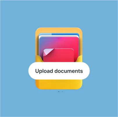
Version A: Standard document upload

Standard document upload system with basic instructions and limited file format support (e.g., PDFs only).

Version B: Enhanced document upload system with the following features:

  • Drag-and-drop functionality for easier file selection.

  • Support for a wider range of file formats (e.g., PDFs, images, Docx).

  • Real-time file size and format validation to prevent errors.

  • Progress bar for each upload.

  • Dashboard reminders highlighting missing or incomplete documents.

Version B.
"Chest Bump"
for User Experience

Version B.
"Chest Bump"
for User Experience

The enhanced upload system in Version B was a game-changer. Here's what we observed:

  1. Reduced User Error: Version B's features like file format validation and progress bars decrease upload errors and frustration.

  2. Improved Efficiency: Drag-and-drop functionality and wider format support in Version B could expedite the upload process for users.

  3. Increased Transparency: Real-time feedback and progress indicators in Version B may improve user confidence and control during uploads.

  4. Reduced Abandonment: Dashboard reminders in Version B could prevent users from abandoning applications due to missing documents.


05- Optimising Loan Application Support. Unveiling the Data-Driven Choice

05- Optimising Loan Application Support. Unveiling the Data-Driven Choice

Traditional loan applications can be confusing. Here, we analyse three support strategies to identify the most effective:

We tested three ways to offer user guides


Help Page

Offers basic information but lacks personalisation for complex inquiries.

Live Chat + Help Page

Enables real-time interaction but can lead to wait times and user hesitation.

Multi-Layered Support.

Live chat + help page
+ finalisation call from a broker.

Gotcha covered!

Comprehensive support throughout the application journey, for all Australians and Koalas.

Comprehensive support throughout the application journey, for all Australians and Koalas.

Multi-Layered Support.

Live chat + help page
+ finalisation call from a broker.

Gotcha covered!

Comprehensive support throughout the application journey, for all Australians and Koalas.

Best Choice.
Multi-Layered Support

Best Choice.
Multi-Layered Support


  1. Reduced Abandonment Rates: Proactive support addresses concerns and keeps users engaged.

  2. Improved Customer Satisfaction: Finalisation calls demonstrate attentiveness, fostering positive relationships.

  3. Enhanced User Experience: Users have access to self-service resources, real-time guidance, and personalised clarification.

The Green Light!

The green light!

Unveiling
the design

The Outcome

The Outcome

A positive impact on the getting finance through
Stratton Finance.

The metrics after 3 months were a testament.

A positive impact on the getting finance through Stratton Finance.

The metrics after 3 months were a testament.

167%

User Application Rates

Before: 150 applications per month.

After: 400 applications per month, a 167% increase.

Impact: Broader customer base and market reach, due to accessibility and ease of use.

32, Digital Artist, San Francisco, CA.

Goals:
Showcase art, earn income.

Needs:
User-friendly platform with minimal fees.

Pain Points:
High minting fees.


88%

Reduced Processing Times

Before: Average of 14 days from application to approval.

After: Reduced to 2 days, an 88% decrease.

Impact: Enhanced customer satisfaction due to faster decision-making.

Keyser Söze, 45, Tech Entrepreneur, London, UK

Goals:
Expand portfolio, invest.

Needs:
Advanced discovery tools.

Pain Points:
Authenticity and security concerns.


Enhanced Brand Image

Stratton Finance solidified its position as a leader in user-centric financial solutions.

The PWA's success generated positive media attention and established Stratton Finance as a forerunner in digital loan applications.

What we learned

What we learned

What we learned

Solid

Research Rules

Understanding user needs fuelled a successful PWA design. User-centricity addressed core issues and streamlined loan applications.

Winning

A/B Testing Guides

Testing variations helped identify winning features and refine the experience.

Future

Focus on Users Wins

Prioritising user satisfaction boosted conversions, brand image, and future growth.

Growth

Iteration is Key

Continuous testing and refinement based on user feedback ensures the PWA evolves alongside user needs, keeping Stratton Finance at the forefront of a competitive landscape.

The Road Ahead


Stratton Finance's user-centred approach to car loan applications paves the way for continued success. Future iterations will focus on:

  • Advanced Features: Integrating features like loan calculators and pre-approval options for a more comprehensive user experience.

  • Data-Driven Personalisation: Leveraging user data to personalise the application process and offer tailored loan options.

Launch to lunch

The lawnch

In the 4 months after my involvement on the project, the team continued to evolve and polish the visual design, as well as finesse the finer functional details as Project Roadster was being built.

Although I was not part of this process, it was great to see most of my work by the spectacular team at Stratton Finance brought to life.

"I want quick approval, less paperwork, and simple online interface."
Busy professional - Sarah